
Expression
Imagery
The 3D world, the character, and what the pictures are for.
Pictures here do one of three jobs: show the person, show the work, or set the room. Anything that does none of those is decoration and gets cut.
Three kinds
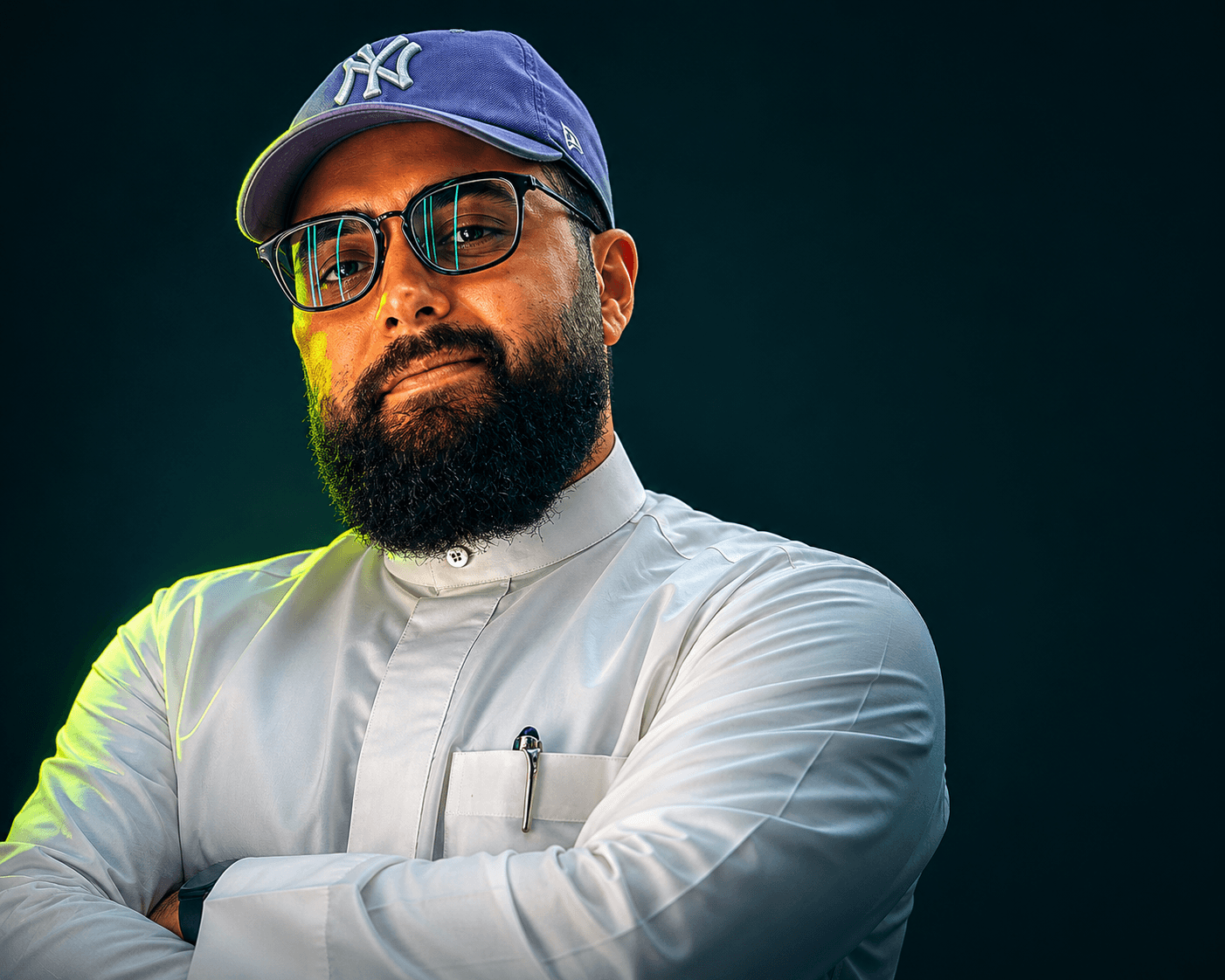
Portrait
One person, mid-thought, not looking at the lens for approval. Available light, dark surroundings, a lot of negative space on one side so type can sit beside it. It is a working photograph, not a headshot.
Workspace
Hands, keyboards, the thing in progress. Shot from where the person actually sits rather than from a styled overhead. If a desk looks staged, it is the wrong picture.
The 3D world
Rendered shapes lit with lime and shape blue, used as atmosphere behind type. Shape blue lives here and only here — it is a light source, never a button.
Never stock
Treatment
Do: Keep the exposure low. Images sit on dark green and should not glow against it.
Do: Leave negative space on one side for type.
Do: Let skin tones stay warm and true. Grade the surroundings, not the person.
Do: Write real alt text — what is happening, not “image of a man”.
Do not: Do not apply a heavy colour wash or a duotone to a photograph.
Do not: Do not crop the mark or the character into a photo as a watermark.
Do not: Do not use shape blue as a photo overlay. It belongs to renders.
Do not: Do not upscale a small image to fill a hero. Reshoot or reframe.